Help me Visualize the Invisible in Design
Hey design friends:
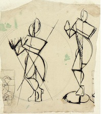
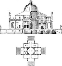
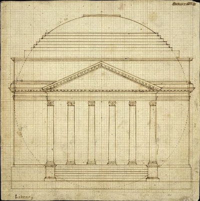
What images do you think of when I ask you about the invisible part of design... the lines and shapes and proportions that make your design hang together in a coherent way?
I'm writing an article to teach computer geeks about design and to explain why CSS sucks as a language for designers. I need some visual support to explain the invisible. Words aren't going cut it. Although beautiful images about typeface design would work nicely. :-)
I've got a few examples here: two from architecture, one a study for a figure drawing. These are in the right direction, but I'd lovee images from many other design disciplines.


